Ridlin was my first freelance project—an experience marked by both excitement and pressure. The client reached out after parting ways with their previous designer, dissatisfied with a design that felt uninspired and disconnected from their vision. From our first conversation, it was clear they weren’t after a quick fix, they wanted a full redesign that felt premium, refined, and purposeful.
The original designs lacked cohesion, with clunky layouts and poor aesthetics. Rather than attempting to patch them up, I proposed starting from scratch. Their agreement signaled trust and gave me creative freedom to reimagine everything. This wasn’t just a redesign, it was a fresh creation from the ground up.
What made Ridlin special was the client's passion. They didn’t just want functionality, they wanted a polished digital experience that stood out. "Premium" meant elegance in every interaction, from the visuals to the flow. Their energy pushed me to think bigger and dive deeper.
Starting fresh was the right call. With a blank canvas, I focused on building a visually consistent, intuitive experience that embodied luxury without sacrificing simplicity. Every design choice, from typography to color to animation, had to reflect that. The project had only begun, but I was already fully immersed in bringing their bold vision to life.

Shaping the Look and Feel
Time was limited, so I skipped deep-dive research and dove straight into design, leaning heavily on the client’s clear vision and chosen color palette. My aim was to make those colors shine, blending a premium feel with playful energy that captured Ridlin’s pet-loving spirit. I began iterating quickly, clean, modern layouts with just enough whimsy to feel alive.
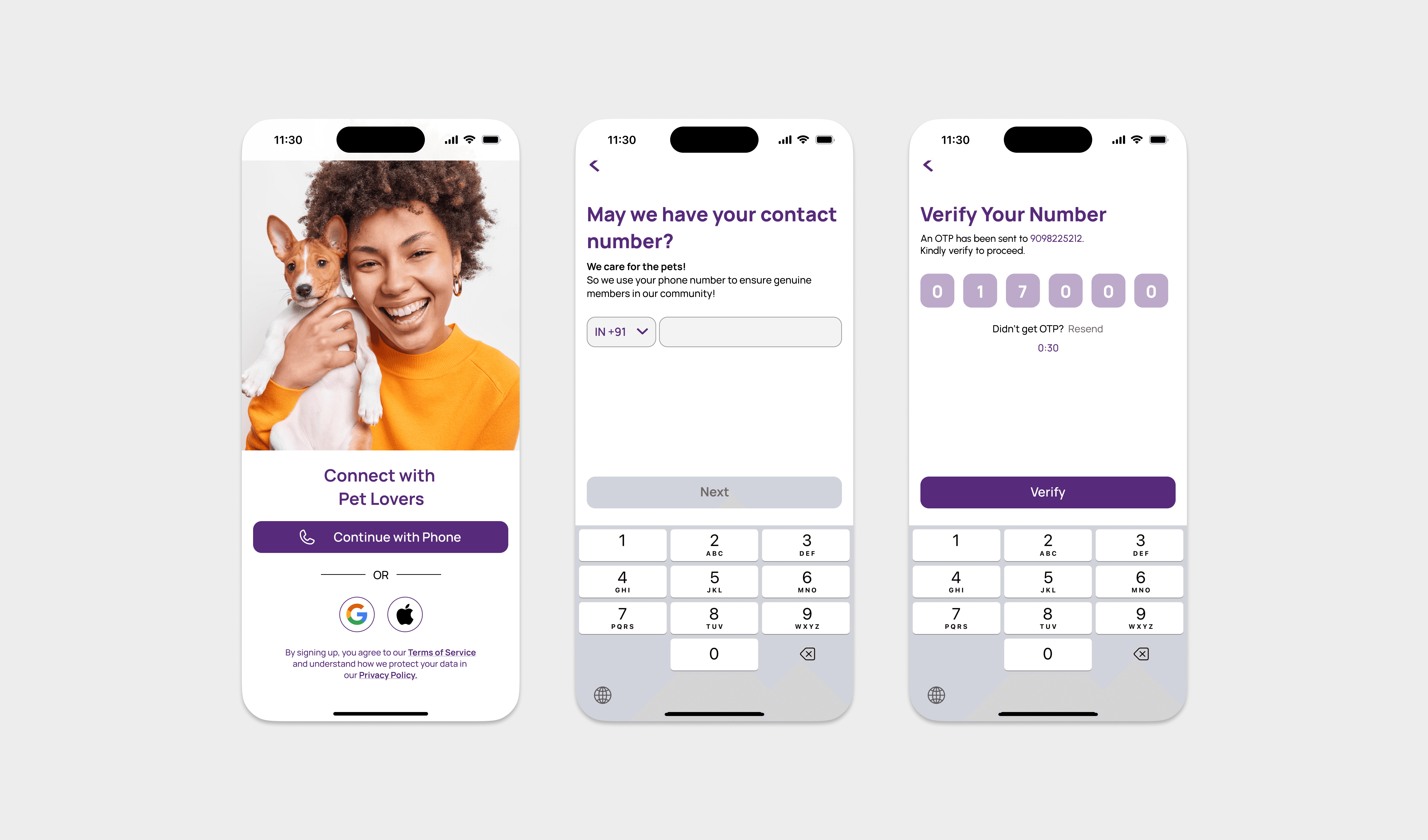
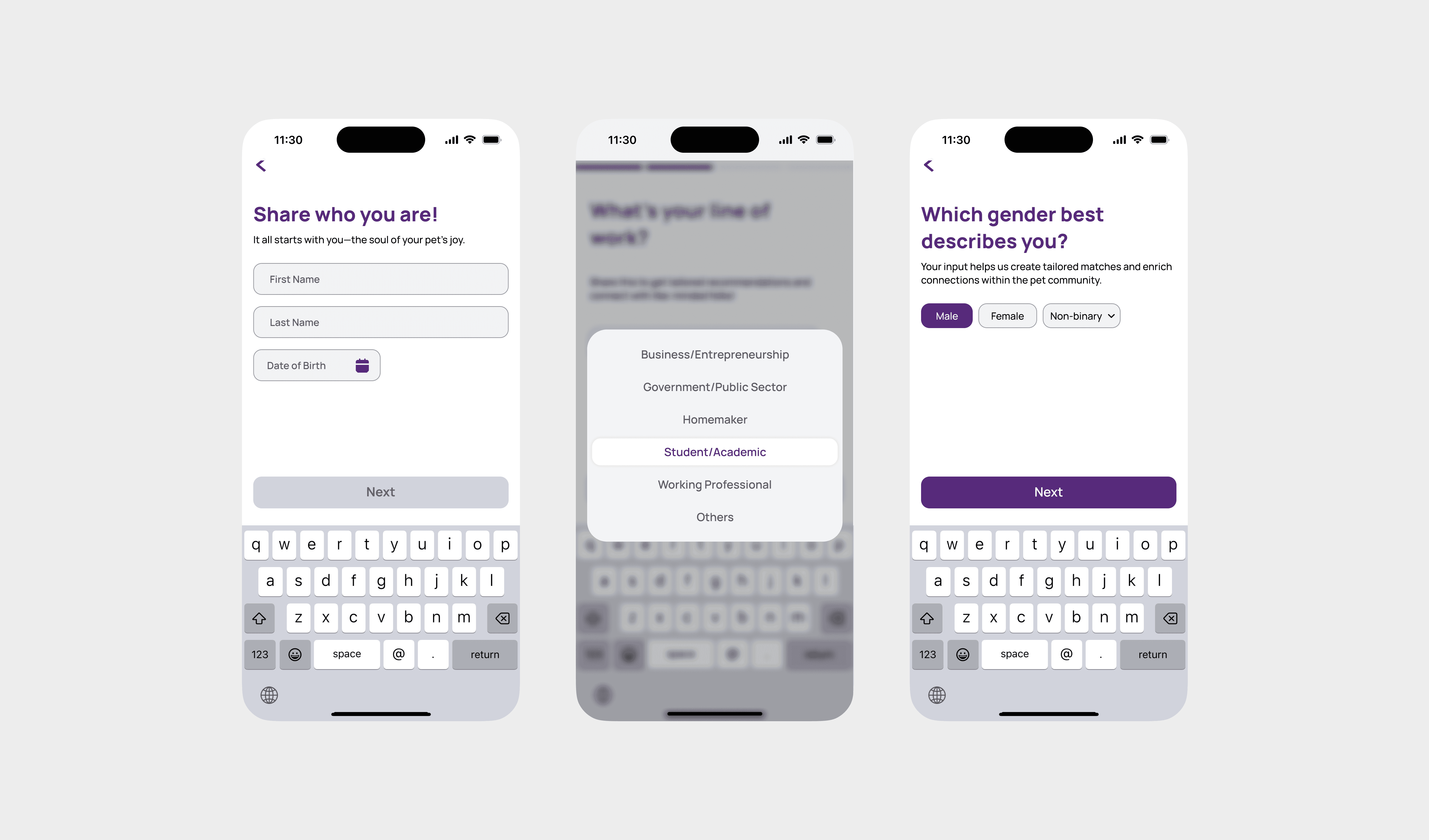
The login screen came first: sleek but inviting, like the entryway to something special. Then came the create account page, designed for ease, users could quickly input details about their pets, from breed to favorite toy, with clear and intuitive fields.
The heart of Ridlin was the Explore section, a swipe-based interface for pet playdates. To keep interactions natural, I borrowed from familiar dating app gestures, putting pet photos in soft, rounded cards that invited touch. Every pixel mattered: spacing, transitions, animations, all finely tuned for a smooth, joyful user experience.
When I presented the homepage mockup, the client’s smile said it all: “This feels alive.” That validation fueled my momentum. Balancing familiarity with flair—animated paw prints, a custom bold typeface—was challenging, but Ridlin was finally taking shape as the polished, pet-forward app the client had dreamed of.
Explore/Home Screen

Bringing the Homepage to Life
The homepage or the "Explore" section, as we referred to it—was the focal point of Ridlin's initial design. I worked my heart out to make it functional and lovely. Every pet profile card had a big, attention-grabbing photo, with information such as the pet's name, breed, and distance conveniently. The bottom bar of navigation pulled everything together with icons for Profile, Moments, Explore, Likes, and Chats, all contained within the client's purple and gold color scheme.
When I presented the client with the homepage mockup, their smile said it all. "This feels alive," they told me, and it was that moment that spurred me on. Finding the right balance of familiar layouts with flair such as animated paw motifs and a bold custom font was challenging yet worth it. The initial screens were finally beginning to come together, and Ridlin was beginning to feel like the high-end, pet-tolerant app the client envisioned.
To see them so enthusiastic it felt like we were actually on the same page.
Once the homepage was in good shape, I moved on to the chat section, where users would interact after being matched. I wanted it to be warm and energetic, as if it was a pet parent conversation. I created a minimalist chat design with ivory and coral speech bubbles and included a tiny paw stamp on messages to maintain the pet theme. The client had indicated that they wanted the users to have a sense of connection, so I included a quick-reply feature with pre-populated messages such as "Want to meet at the park? " to enable easy chatting. All of this section was about creating genuine interactions, and I was looking forward to seeing it pan out as Ridlin's personality kept coming through.
Chat Screen

Designing the Chat Experience
Once the homepage was solid, I moved on to the chat area, where the magic of Ridlin would really take place—bringing pet parents together once a match had been made. The client wanted the area to be warm and chatty, so I began with the central Chats screen. I created a minimalist layout with "Inbox" and "Requests" tabs along the top so users could toggle between ongoing conversations and new messages easily.
To design the chat interface itself, I opted for a clean, minimalist look and let the conversation take center stage. Speech bubbles switched between ivory for the user and purple for the other party, maintaining continuity in color scheme.
The client had put great emphasis on creating connection, so I included a quick-reply option with such responses as "Want to set up a playdate? " to assist users in breaking the ice. To see the chat section coming together was a victory—Ridlin was beginning to feel like a place where pet parents could really connect.
Looking Back on the Journey
Reflecting on Ridlin, I can say it was more than just my first freelance project—it was a crash course in trust, creativity, and grit. From the early sketches to the final tweaks, every step taught me how to balance a client’s vision with practical design choices, all while working under tight deadlines. The client’s joy at seeing their dream app come to life was the ultimate payoff, and hearing their plans to launch Ridlin with confidence made every late night worth it. This project didn’t just shape a pet dating app; it shaped me as a designer, proving I could turn a blank slate into something truly special.